Fahrenheit’s New Website

Branding, Graphic Design, Multi Media

9
Transforming a website that needed additional functions AND uplifting the design to match the superb quality of the restaurant.

If you have ever visited downtown Fredericksburg wanting an extraordinary and elegant meal, chances are you have visited Fahrenheit 132. If you have not, let me give you a quick glimpse of your experience. As soon as you enter you are greeted with warm rich tones of wood and decor that instantly relax you from the hustle of your everyday life. You are then greeted by the knowledgeable and kind staff to help you navigate their luxurious menu, and then taken aback by the superb food presentation to round off the intimate evening. An evening at Fahrenheit 132 is a time to slow down and enjoy the finer things in life.

Wish List

I was approached by the owners of Fahrenheit 132 and asked if I was able to implement a system that would allow them to sell their gift cards through their website. This had been on their wish list for a couple of years, especially around the holidays, but each year that it was brought to their attention it was too late in the season to make any changes. Since COVID-19 was already putting a massive hold on their business (as it had with many other restaurants in Virginia), they realized it was the perfect time to dive into this project.
I had followed them for many years through social media, but honestly never had visited their website. When I took my first look, I was slightly shocked. It wasn’t that it was a horrible website, (granit it needed some improvements) it was the fact that it felt like a completely different restaurant. That luxury, elegance, warmth and calming notion you have when you walk in the doors was NOT at all the immediate feeling you received when you looked at the website. It was bold, rough, and hard.  

The Analysis

Let’s break it down a little of why some elements may have been chosen, what they were construing to the viewer and how we were able to improve. 
The fire image in the background of the home page was probably chosen for a couple reasons. Fahrenheit 132 is a high end steak restaurant that cooks on an open flame. It is also a play on the name. In order to have your steak reach a temperature of 132 degrees fahrenheit, you need fire. But 99% of visitors do not take the time to depict these elements, and this is the difference in hiring someone to create a website, and hiring a graphic designer who not only is able to make the website functionable but really convey what you business is about. 
This fire image psychologically initiates a chaotic feeling to the viewer. Instead of the warmth and calming aspect a customer has when they walk into the building, the website viewer immediately has a slight fear as we associated fire with burning, hot, and the need to run to be safe. Am I saying someone was clicking on this home page and jumping out of their seat due to this background image? NO. I am explaining that a lot goes into image choice. Many have heard that colors can change how a person feels about something.. Perfect examples are oranges, reds and yellows tend to make people think about food (why do you think McDonald’s, Burger King, and Chik-fil-A use the colors they do?). So if a color has so much impact, don’t you think an image has even more?

The other issues that needed to be addressed was placement of information. Some of the text was hard to read even though it had a slight background. The beautiful photos that are shown on social media every day were nowhere to be found, and there wasn’t a clear flow of information on the page.

New Design

Color Choice

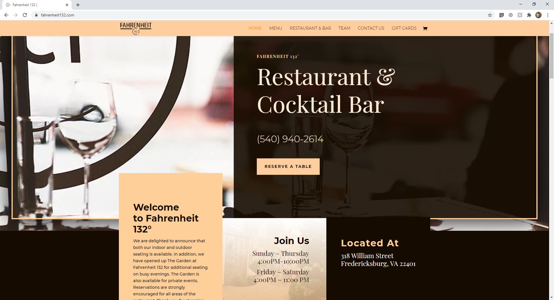
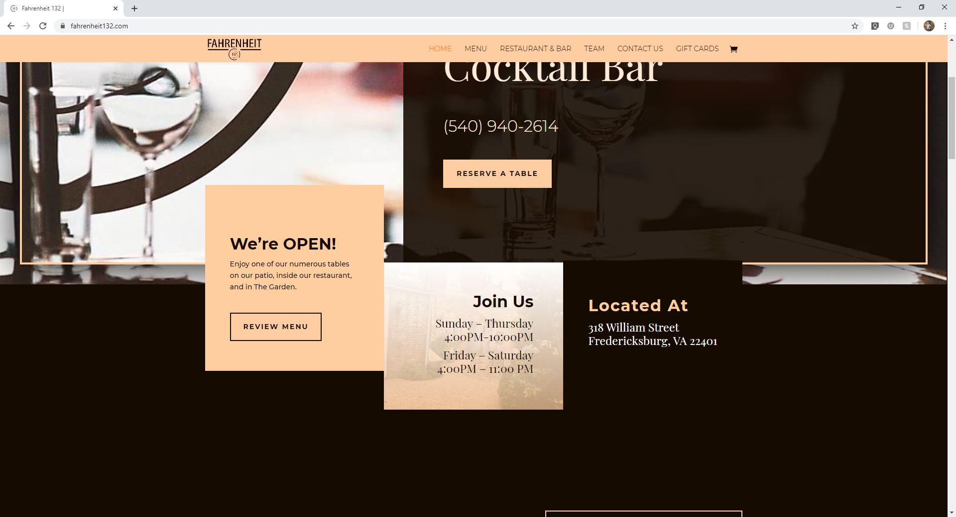
I wanted to keep the overall darker theme, but still be able to provide warmth. The accent tan color that was chosen not only brings the comfort and warmth I was looking for, but also slightly brings to mind hunger just as I had spoken about previously.

Placement of Information

The top of any website is the most expensive and important real estate. With one quick look it should be able to tell the view:

• Company Name
• Type of Establishment
• Location
• Contact Info

If you have not answered these questions and captured the viewer’s interest within 10 seconds then they have already moved on to a new site. 

Images

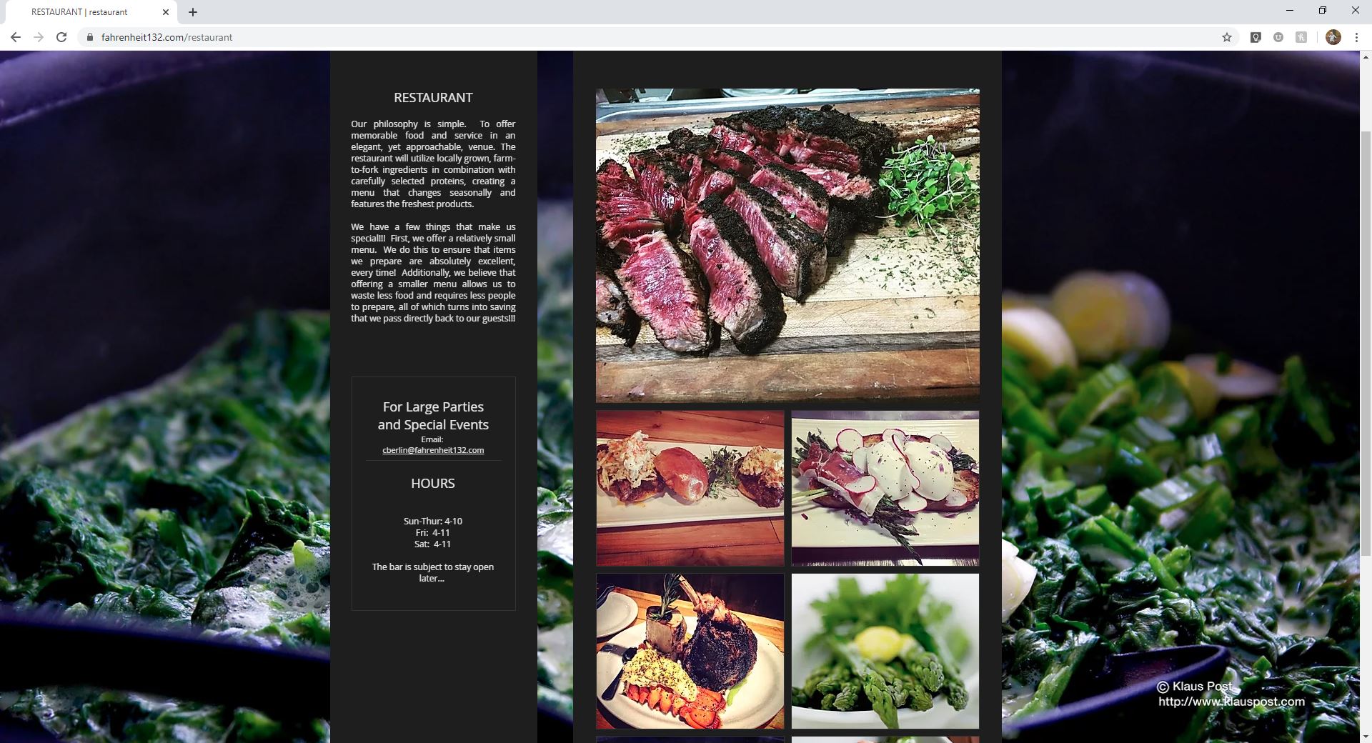
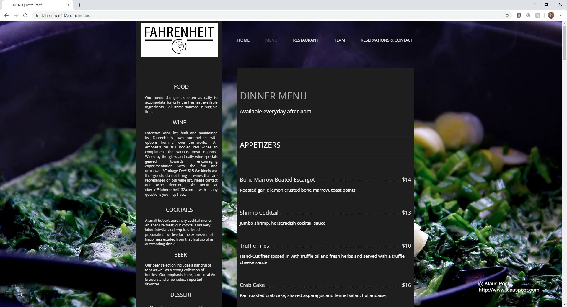
Stock photos have their place, but Fahrenheit 132’s website was not that spot. They have so many amazing photos that show off the creativity of the food, the warmth of the environment, and the pride in the decor. Even if the viewer doesn’t notice these points, they are able to obtain all these emotions by images that have been chosen. Having the images on a solid darker background also gives them the individual attention they deserve. Now that the images are not competing over one another it also gives itself a new sense of calmness.

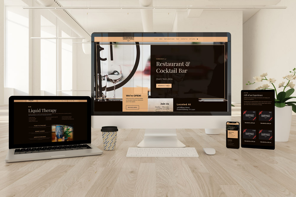
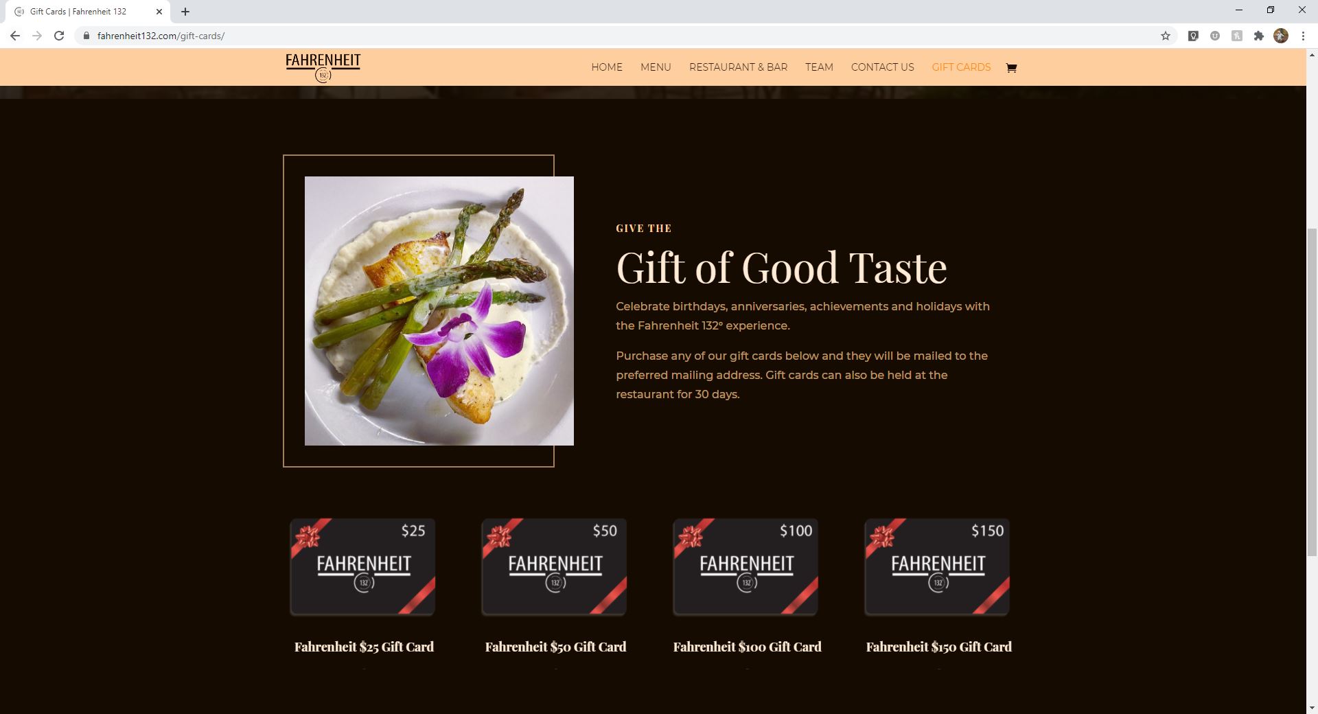
Not only did I redesign their website to match the experience a guest has at Fahrenheit 132, add the ability to sell gift cards with a click of the button, but we also made sure that it was responsive on all devices. This website was also designed so that the owners are able to make quick changes to the menu, announcements, and hours.

I can break down each page of this website, why decisions were made, and how everything we see creates some kind of feeling whether we realize it or not, but I will stop here. It truly is my passion to not just put together a website that is functional. For each of my clients my goals are to make them user friendly, visually appealing, accurately represent their company, and something they are proud of.

Simple Clean and Elegant is what the design goal was and I believe we achieved it. Who knew a simple need of online sales could make such a huge impact… well… I did!

Before and Afters

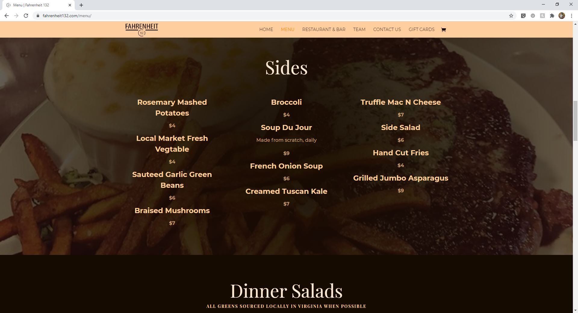
Before Menu Page Layout

After 

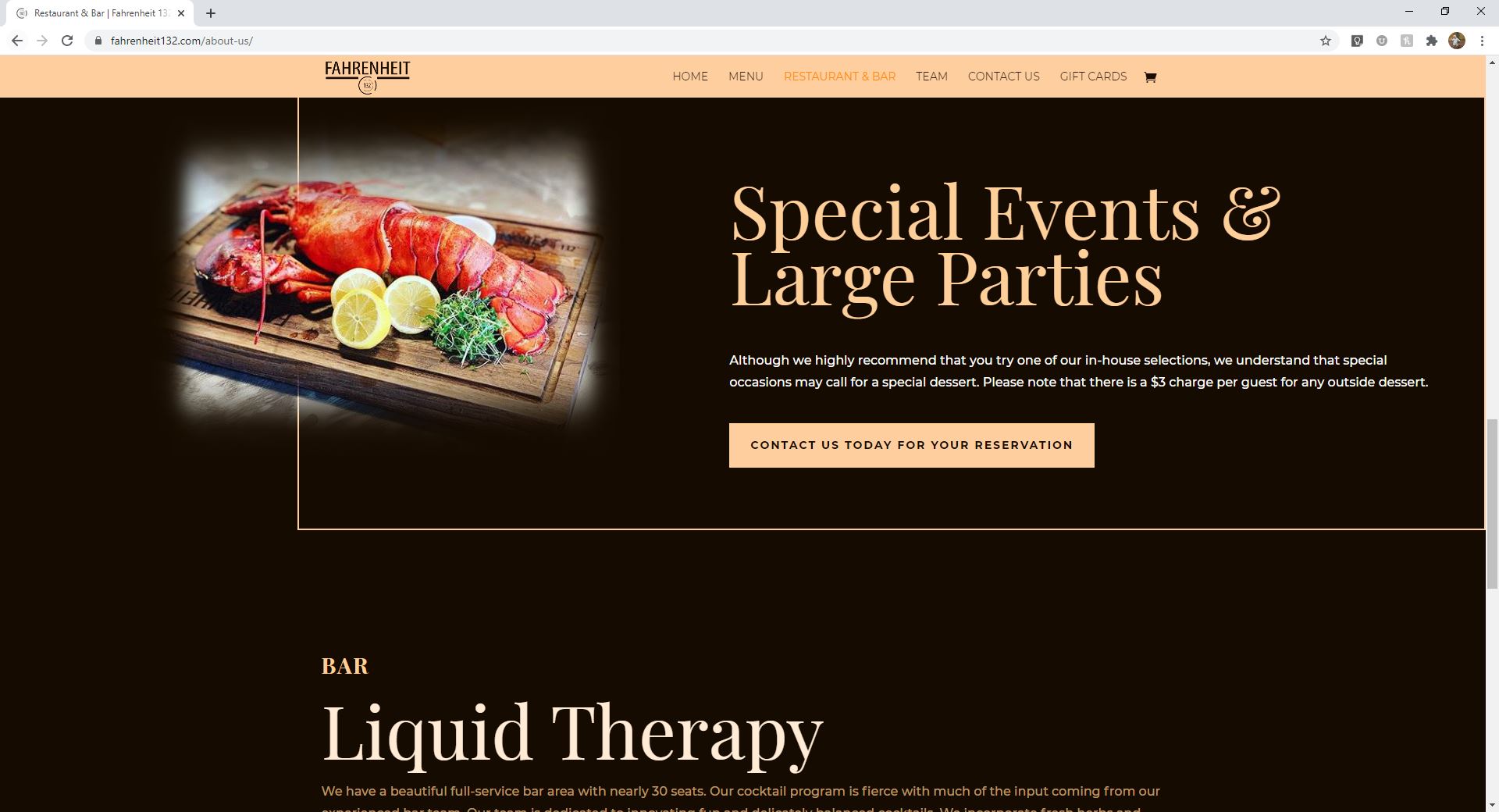
Before Large Parties Layout

After 

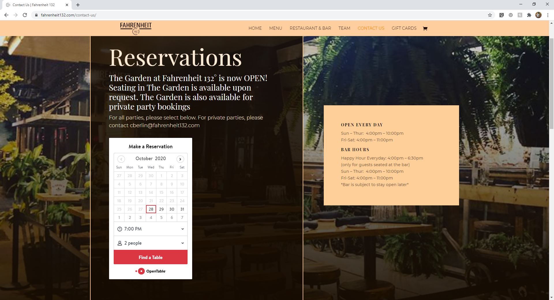
Before Contact Us Page Layout
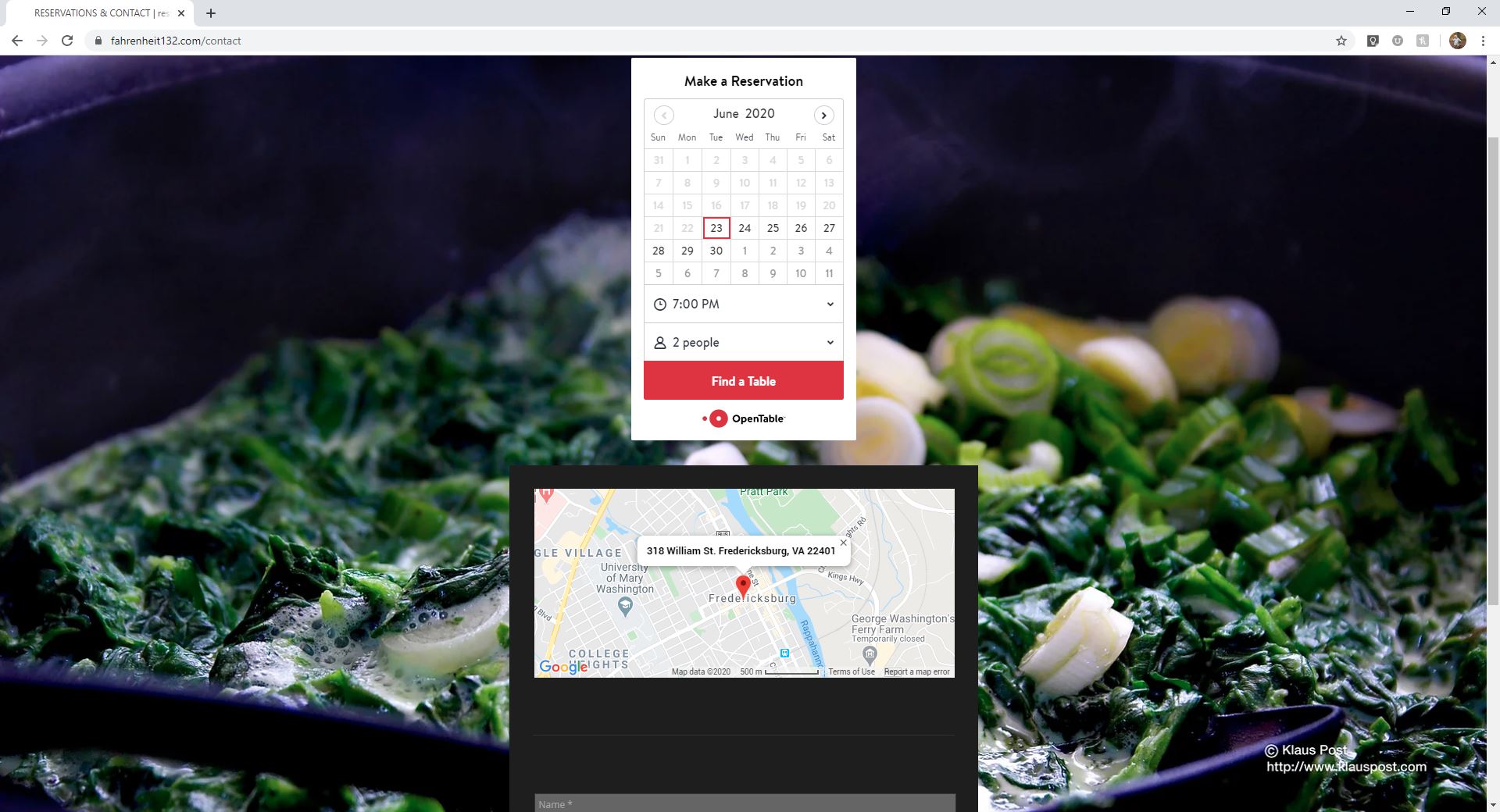
After 

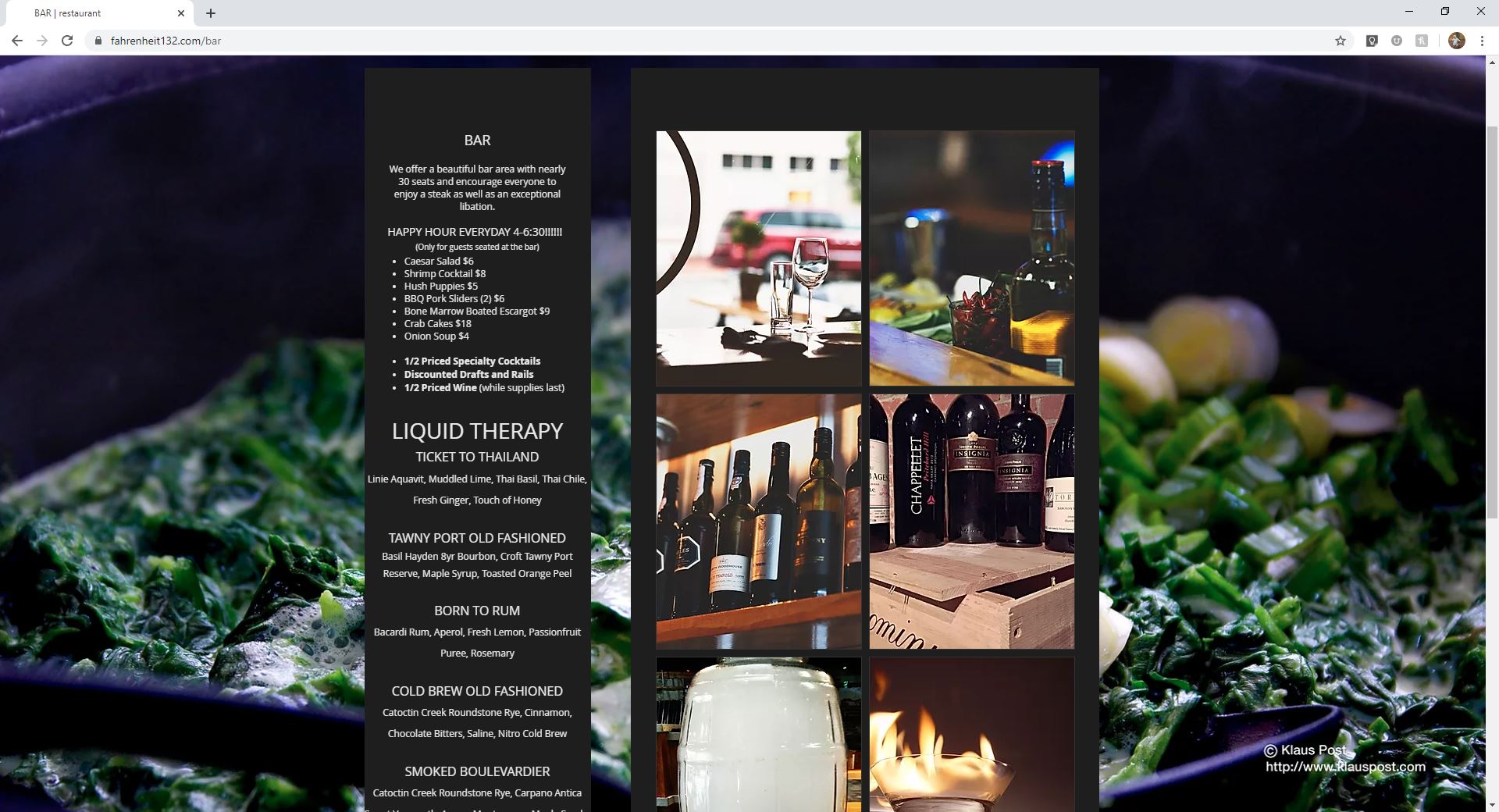
Before Bar Page Layout
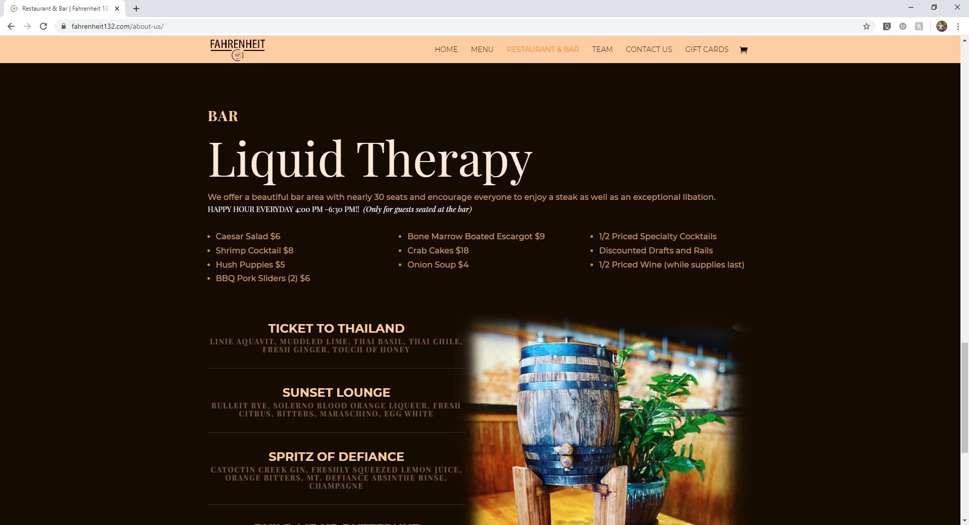
After 

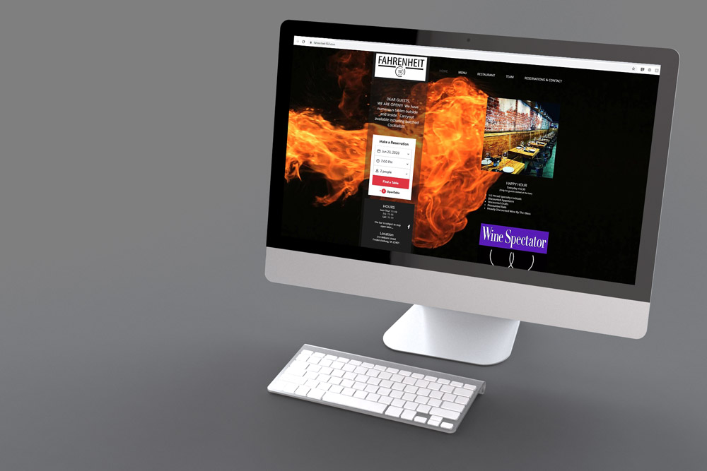
Before Home Page Layout

After